


Nonprofits are the heartbeat of change. You rally communities. You rewrite futures. You take the big, bold vision of a better world and turn it into something tangible.
At Bloomerang, we’ve always known this about the people we serve: your ambition isn’t something to tone down. It’s something to celebrate. Too often, nonprofit leaders are portrayed as scrappy, modest, or endlessly resourceful—and while that’s all true, it’s only part of the story. What we see is something even more powerful: visionary leaders with bold goals and unstoppable purpose.
So we asked ourselves: Does our brand reflect the vibrancy, optimism, and ambition of the sector we’re here to serve?
That question led us to this refresh—a brighter, bolder Bloomerang that’s built to match the energy and excellence of the nonprofits we serve.
Reflecting the abundance we believe in
This brand refresh is not just a new coat of paint. It’s a re-commitment. A declaration that abundance is not a fantasy—it’s a strategy. That nonprofits aren’t defined by what they lack, but by how boldly they lead.
We wanted every part of the Bloomerang identity—our colors, our typography, our voice, our visuals—to reflect the energy, optimism, and boundless possibility that lives at the heart of your work. The result is a new look and feel that’s still unmistakably us—but more aligned than ever with who we serve and what we believe.
What’s new (and why it matters)
A vibrant visual system for a vibrant sector
We’ve introduced a dynamic, joyful palette that radiates optimism and celebrates momentum. You’ll see bold colors and expressive organic shapes inspired by growth and connection. Every element is designed to feel energetic and human—because that’s what nonprofit work is.
Our refreshed logo has a refined shape and updated composition that feels more modern, confident, and fluid.
A voice that knows and honors you
Nonprofit leaders are pulled in a thousand directions. So our voice needed to do what great partners do: cut through noise, offer clarity, and remind you of your gifts and strength.
Whether you’re reading a product page, a campaign headline, or a help article, you’ll find us sounding more like the partner and cheerleader you’ve always known—rooted in your reality, never shying away from challenge, and always nudging you toward what’s possible.
We speak in a tone that’s:
- Validated – We see the work you do. We honor it.
- Invigorated – We bring joy and optimism, even when things get hard.
- Savvy – We share insight you can act on, not fluff.
- Unstoppable – Because we know that’s what you are.
One Bloomerang Giving Platform
To support this momentum and meet the evolving needs of the sector, we unified how we talk about our tools and the Bloomerang Giving Platform. At the start of 2024, Bloomerang acquired Qgiv, a leader in fundraising solutions. Today, Qgiv by Bloomerang transitions to Bloomerang Fundraising.
This renamed product brings all of our giving tools under one unified product brand experience and platform—making it even easier for fundraisers to deliver seamless, donor-centric experiences and build lasting relationships. These updates are part of our promise: that every part of Bloomerang works together to help you grow.
More than a new look: a clearer expression of what we stand for
Everything about this refreshed identity is designed to echo our belief that nonprofits are not just worthy of better tools—they’re worthy of better expectations.
We’re not just here to sell great software. We’re here to partner with nonprofits to:
- Ignite next level impact
- Connect supporters to causes
- Champion the for-purpose movement
- Fuel growth through technology AND people that are built for purpose
Because when your mission is a better world, “good enough” just isn’t.
Made with—and for—the nonprofits we serve
This brand refresh wasn’t built in isolation. It was shaped by what we’ve long known about the challenges nonprofits face—backed by years of research, platform insights, and, most recently, focused conversations with our customers and partners.
We conducted interviews and facilitated a customer focus group to pressure test our thinking and ground our decisions in what really matters: making it easier for you to fundraise, connect, and grow. Combined with what we’ve learned from supporting tens of thousands of nonprofits over the years, this input helped shape the Bloomerang brand that aligns with your purpose and is grounded in your reality.
We also prioritized accessibility at every step of the process. From typography and color contrast to layout clarity and tone, we’ve designed our brand to be inclusive across every touchpoint. Whether someone is exploring our website, attending a webinar, or interacting with our product, they should feel welcomed, supported, and seen. Because design should never be a barrier—it should be an open door.
Looking ahead, together
This isn’t just Bloomerang 2.0. It’s a fresh new chapter in our shared story—a chapter powered by insight, ambition, and a deep belief that your impact deserves to be celebrated, supported, and scaled.
So whether you’re just discovering us or have been with us from the beginning, we hope this new identity feels familiar in all the right ways—and energizing in the ways that matter most.
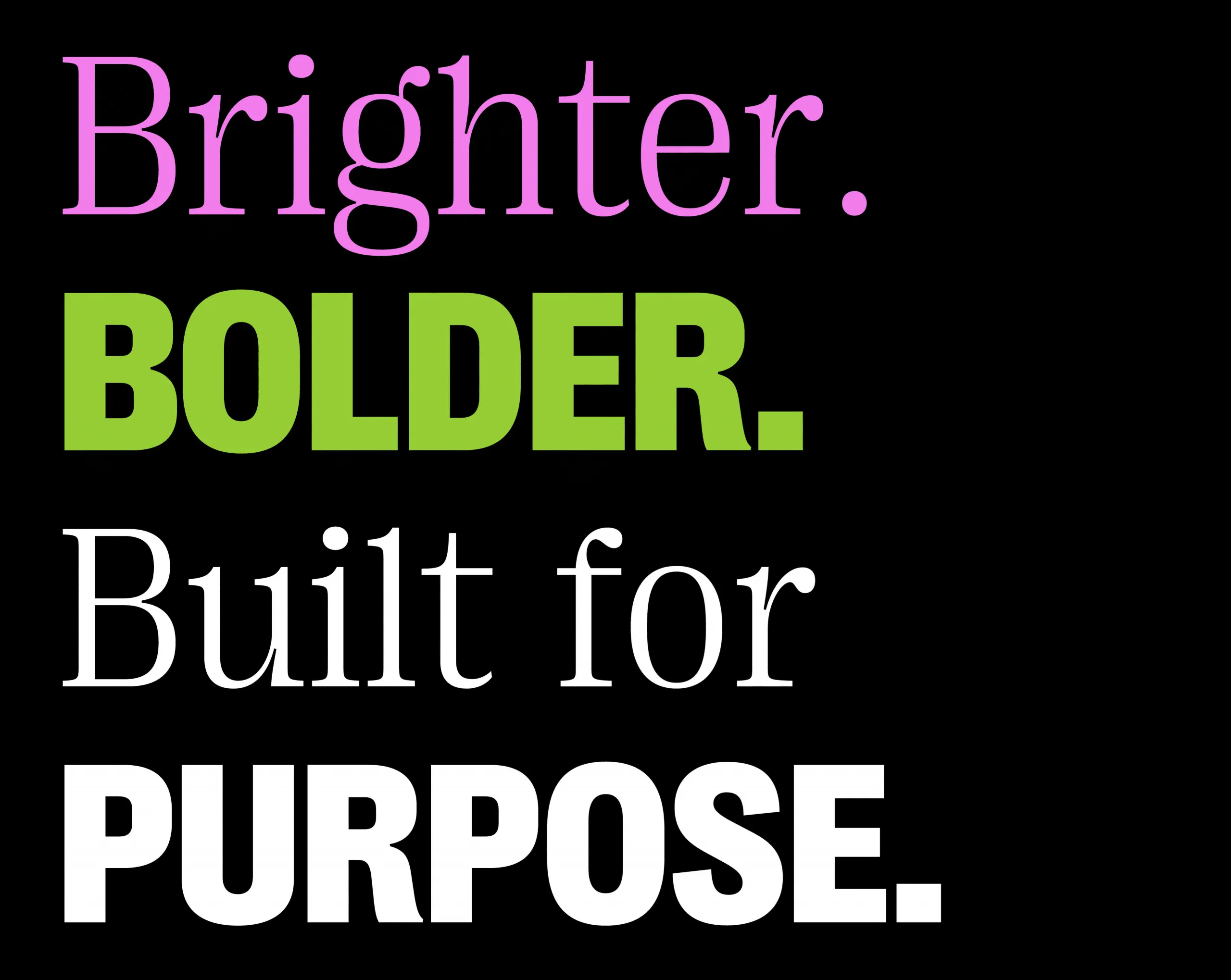
Because we’re still Bloomerang. Just brighter. Bolder. And more built for purpose than ever.